
Classic Fiction of the World: Data Visualizations
Insights on the Top 500 Novels
Introduction
Welcome to part 2 of our exploration through classic fiction of the world! In our previous post, we breifly discussed why one might want to look at data on classic literature. You’ll remember that we scraped data from the OCLC Library 100 List and the List of best-selling books Wikipedia page then cleane and combined that data with data provided by Shane Sherman of https://thegreatestbooks.org/.
In this post, we will explore that data visually to see if we can answer questions such as:
- Where are the most popular books in the world from?
- When were these books written?
- Who are the most prolific authors of the books that are considered classics?
Visualizations
Country Data
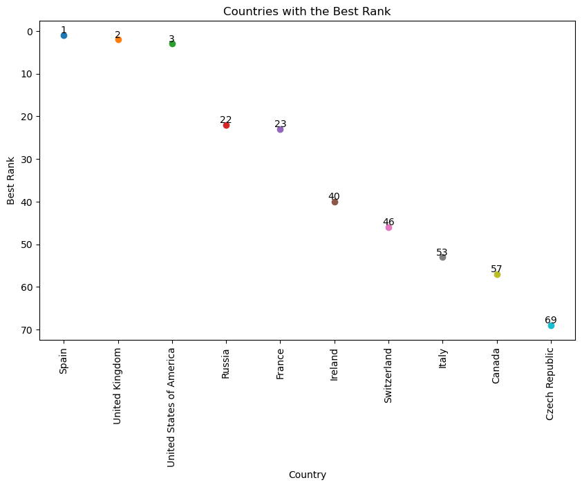
I wanted to illustrate countries and their best ranked book that they produced. A scatter plot seems like an odd choice, but I couldn’t figure out any better way to show this. Despite the simplicity of this graph, a lot of information is packed in it. Of course we see each country and the best rank one of their books achieves, but in this we see which countries dominate certain intervals of the ranking system.
For example, since Russia’s best book is ranked 22, that means that the three countries listed before it (Spain, United Kingom, and United States) are the only countries with books ranked from 1-21. Looking out to the top 50, only seven countries produced all of the top 50 books, since Italy, listed eighth, has its best ranked book at 53.
Mapping Literary Proliferation:
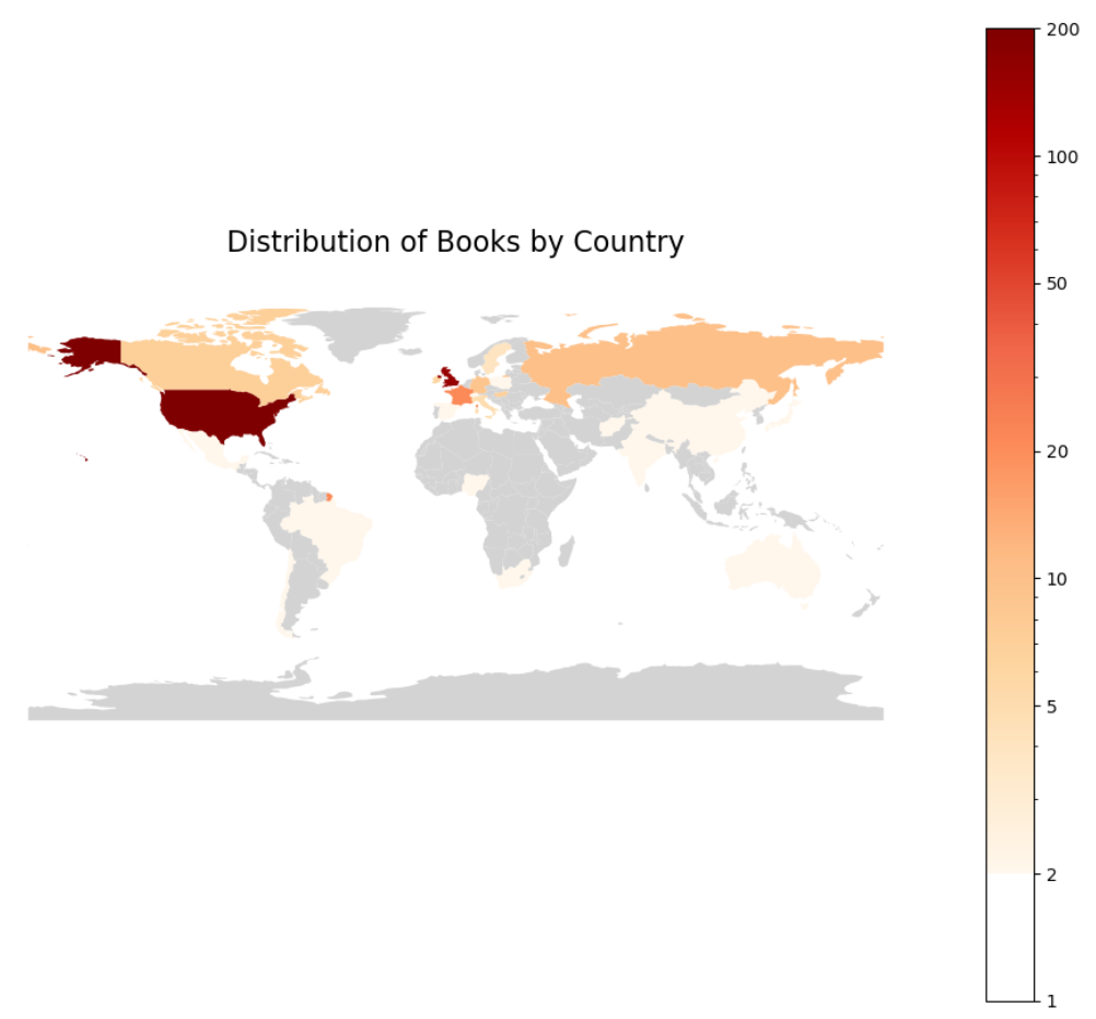
The impetus for this project was to get a macro view of great world fiction. The below choropleth map highlights the global distribution of literary works. Note that the scale here is a log scale to better distinguish differences between countries on the lower end of the scale. The United States, Britain, France, Russia, Germany, and Canada each stand out as producing a higher number of books on this top 500 list. This visualization not only illustrates the concentration of literary production in these regions but also raises questions about the factors contributing to such disparities. This and other visuals we will see later caused me to ponder on possible language bias in the data. WorldCat claims that its list consolidates lists of libraries around the world, though it isn’t hard to imagine most of their data still coming from libraries in the United States.
Bestsellers by Country:
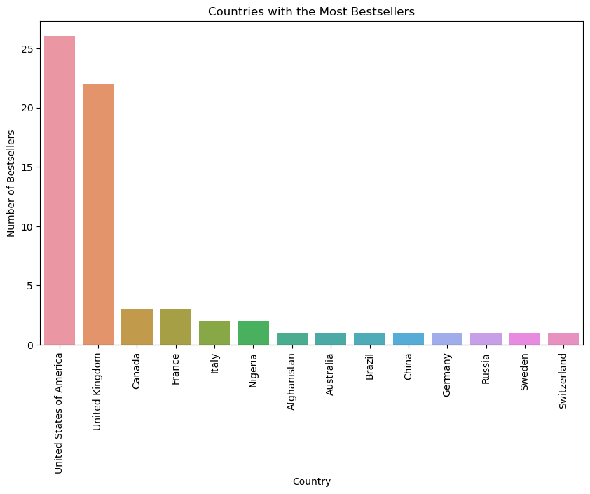
When looking at all bestseller data, it is important to keep in mind that the term “bestseller” is determined solely on whether or not it was on Wikipedia’s bestseller list. I noted in my previous post that Wikipedia acknowledges that some books may have sold tens of millions of copies, but because they have no reliable data, those books are omitted. These include such books as The Lord of the Rings trilogy. Thus most books that are classified as bestsellers are more modern.
The United States and the United Kingdom take the lead by a significant margin, likely due to the widespread influence of the English language and the global reach of their cultural products. Yet, the presence of countries like Nigeria and Afghanistan on the graph brings to light the rich narratives emerging from different cultural contexts, which may signal a Western desrire for a great variety in literary tradition.
Author Data
In the realm of literature, the names of certain authors are recurrently echoed with reverence. But, what distinguishes these literary titans from their peers? Through the lenses of data visualization, we can glean insights into the prolificacy and prominence of the top authors in fiction.
Prolificacy and Literary Dominance:
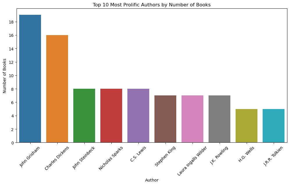
Turning to a bar graph illustrating the number of books by the top 10 most prolific authors, we observe the sheer volume of output as a metric of literary dominance. John Grisham and Charles Dickens stand tall, their bars soaring high, indicative of their extensive bibliographies. The problem here is, I have never heard of John Grisham, and I have only every heard of a single one of his books, The Pelican Brief. So let us turn to a comaprison of author’s book’s ranks.
Here in our boxplot, we see a much more expected picture. Dickens at the top. I do have a great bias towards Dickens as I read A Christmas Carol twice a year and many of his other books are among my favorite books of all time. If we but compare Dickens and Grisham, we see that Dickens wrote more books of higher rank than Grisham. Dickens’ worst book is at Grisham’s median ranked book, while Grisham’s best doesn’t even make it to Dickens’ median.
Another item of note is that the four British authors on the list are within the top five of this graph. This does seem to indicate a sort of continued British dominance over all other countries, including the United States, in literature worldwide.
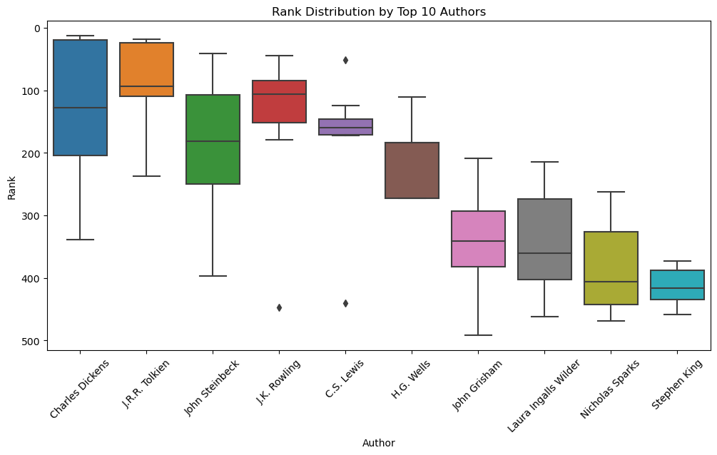
These visualizations prompt deeper inquiry into the nature of literary success. Does quantity beget quality, or is it the enduring resonance of a single masterpiece that cements an author’s place in the pantheon of greats? You don’t know all of Dickens’ works, but you may better know some of them due to the success granted him by titles such as A Christmas Carol, Great Expectations, and A Tale of Two Cities. The ranks do seem to indicate that a single work can elevate an author to greatness, regardless of their productivity.
Genre Data
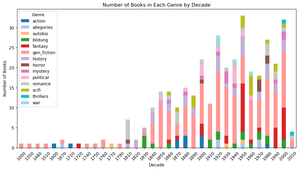
Before we look at genre, I offer another disclaimer. Not all books in our data had an assigned genre. Those that did not are disignated as general fiction, so most books will be of that genre in the data. Nevertheless, we can still glean insights from the below visualizations.
We can see that more specialize genres didn’t really arise until after the start of the 1800s, though very few books make it onto the list that were written before 1800. We should also remember that this is not a survey of literature but the books most commonly found on library shelves across the world. We still may look at this bar chart as a historical ledger, documenting the rising and waning tides of genre popularity. From the 1800s onwards, we see a steady growth in lasting literary production, culminating in a colorful explosion in the 20th century. The ascent of genres like fantasy and science fiction in the latter half of the 20th century reflects not just a cultural shift towards speculative storytelling, but also the technological advancements and escapism sought during times of global upheaval.
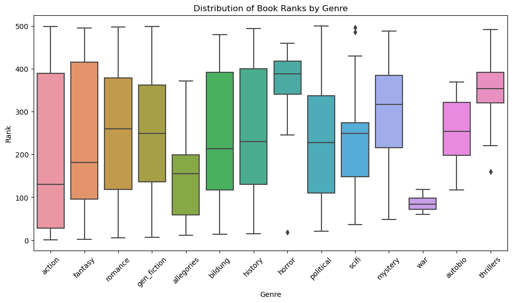
This boxplot of ranks is far different from our author-rank comparison. The vast majority of these genres have a very wide range of rank. The war genre has very low spread, though this does seem to be the case due to small sample size. The more intersting part of this graph is which genres have the best ranks which is shown directly by the order the genre’s are listed. Despite the immense quantity of general fiction, it takes fourth place, indicating that particular genre may play a role in longevity of culture prominence for literature.
Conclusion
This is just a sampling of the different way one could visualize this data. If you would like to play around with the data yourself, here is a link to my GitHub Repository where the data and code can be found. While you’re at it, check out my interactive dashboard which has some pre-made graphs to visualize the data in different ways.
“Ignorance, the root and stem of every evil.” ― Plato